
 The beginning
is such an exciting point in the painting as you are filled with imagination, hope, optimism, and energy. The naked canvas stands before you, ready to get to know you and to reveal it’s secrets to you. The beginning is in many ways the end as so many of the decisions that you make now will influence the direction that your conversation will take. The vigour, the story, the colour are all molded in your psyche now and it is at the beginning that it is more important that ever to act with intention not by default. This is why I talk so much about starting at the end.
Starting at the end
You always start at the end. We’re human and this is the most natural thing to do when we’re interacting with our environment, we always have an intention, a context or an imagined outcome. It may be the idea of the exploration for exploration sake or it may be to reach an end point, to build a friendship, develop a lover, reach Cape Town via a circuitous route, achieve a just out of reach physical goal, heat the water for tea etc.
There is always intention, an end goal and how you start determines how you finish and this is especially true in painting. Set your intentions, be aware otherwise at the end of the painting you will feel frustrated and wonder how you arrived where you are and how you can be the painter that you really want to be. START AT THE END.
Starting at the end is essentially the idea of concept but it is also more, this is painting after all so it is so much more.
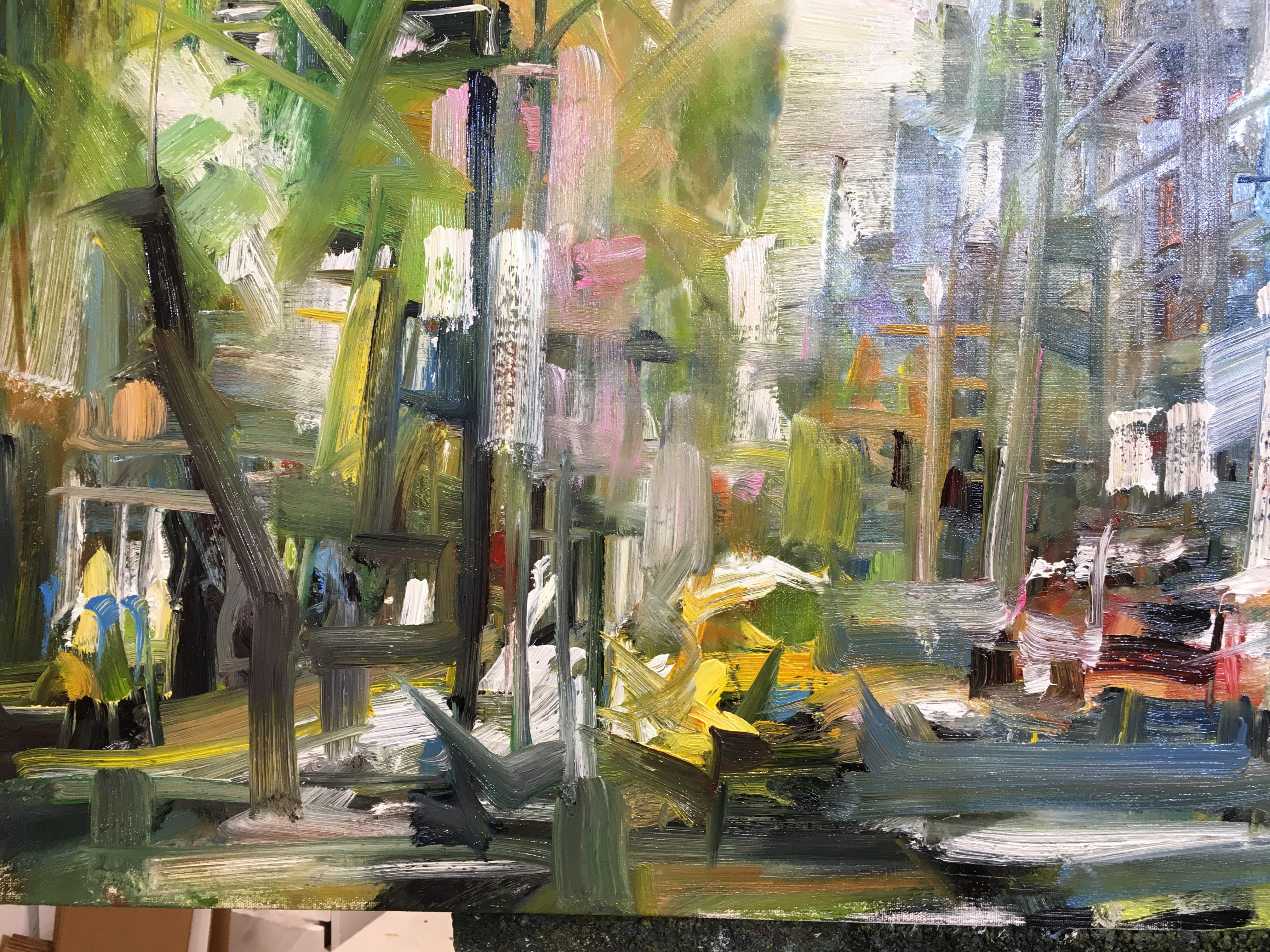
Starting at the end is considering the narrative of your painting, the story and the emotional content. What is it that you are communicating, what is it that is compelling you to paint this painting? Build this idea in your imagination and explore it, develop the characters, imagine the setting, feel what you want your viewer to feel, visualize the idea of the painting in your minds eye (this applies to abstraction as well). Allow yourself to be carried away in your intention for the painting so that when you begin, you are not concerning yourself with the strictly technical aspects and instead you are thinking about the poetry. The poetry speaks to us directly. This does not exclude attention to the technical, my assumption is that you have a handle on the basics of composition, perspective, vanishing points etc. It means that you ensure that you also include the poetry and should you need to make a choice between the technical and the poetry, always choose the poetry.
This is painting and the medium betrays our attitudes and thoughts so it is important to be physically present to the painting as well as giving your imagination over to it. Start a painting with energy and commitment even if you plan to create a placid piece as this is the only way to give energy to the brushstrokes. It is easy to develop calm later but almost impossible to increase intensity if it is just not there.
(Click here to see an example)
Decide on your black
I love this as it is an intriguing area which I still do not have a complete handle on and which I know there is so much more to explore but at the time of writing this, I am still preoccupied with understanding complexity. The intrigue with your black is that is is both a colour and a concept. What do I mean?
Black as a colour is pretty self explanatory, it is an area which appears to lack colour as it absorbs the colours that exist on the spectrum that our eye can perceive ie: it absorbs red, blue and green light waves so we understand it as black as no information is being reflected to us.
Black as a concept is intriguing and important when starting a painting. It is true that every area in the painting is relative to all areas in the painting and that each area will look different when you adjust the surrounding areas against which you make sense of each area. With this in mind it’s logical that in painting, any colour can be black as by definition black is an area which reads as possessing no colour and if colour is relative in a painting then we could reduce the visual information of any colour by choosing the contextual colours well. I am sure that there are artist’s who have already played with this and I have not delved into it but the idea of what a painting would be like if neon pink were the chosen colour for black is very intriguing. I am not talking about neon pink looking like black but being interpreted as black. Just something to think about.
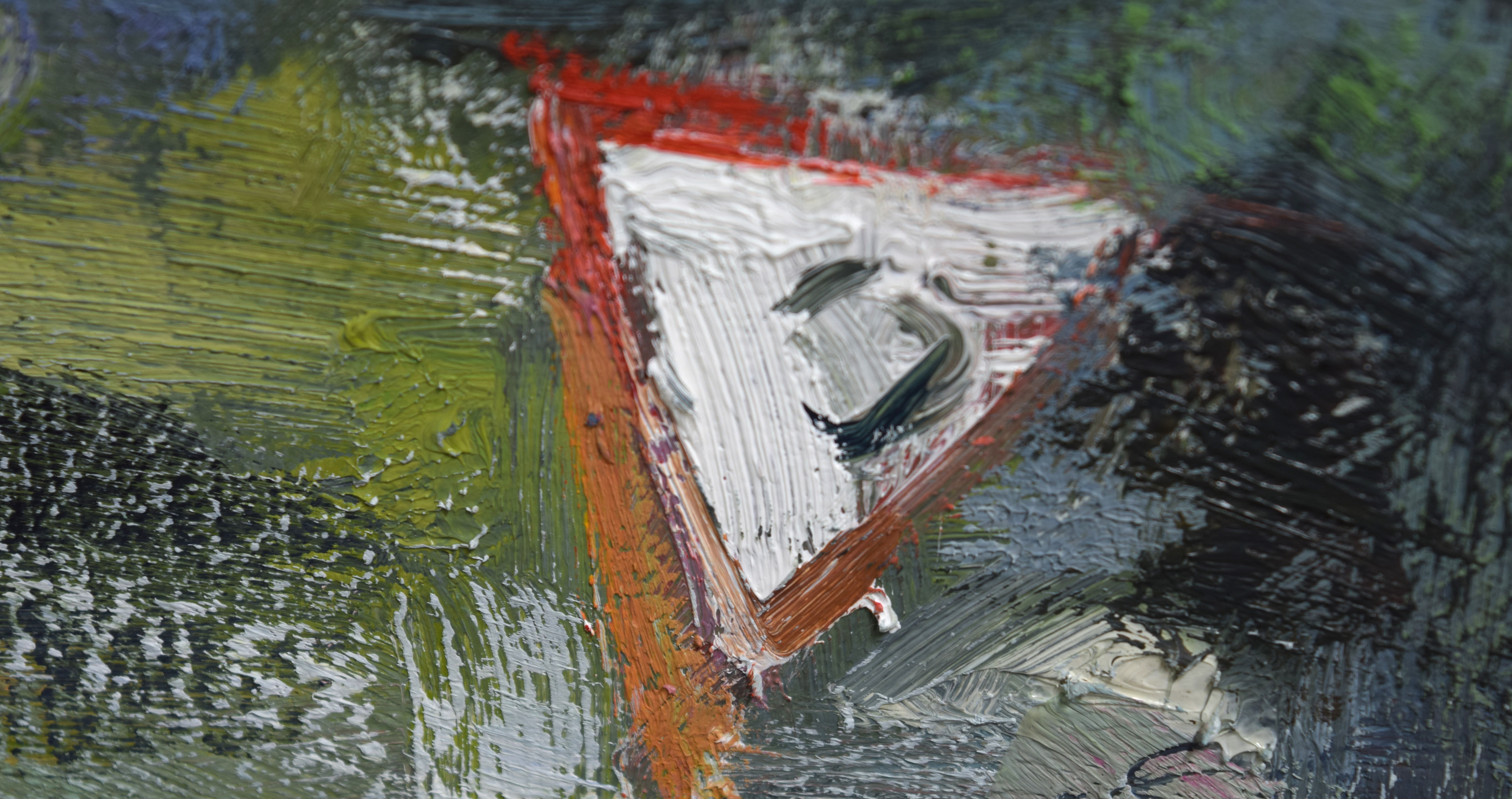
For starting your painting though and for now, consider your end point or your concept and remember that how you start is how you will finish so choose the intensity of your black and the warmth/coolness of it in consideration of your concept.
My favourite black is Pthalo Green mixed with Alizaron Crimson but it is very cool and instills a beautiful grey into the painting. This black is great for my urban pieces but when Cherry Blossom season hits Vancouver, it is folly to start here as I spend the rest of the painting fighting to breath the light pinks into the spring lightness of the painting. Instead, I start at the end and choose Alizaron Crimson or Cadmium Red as my black and although I haven’t pushed the idea of black as a concept, this choice sets me up to attack new battles not bog me down in staid arguments.
(I am still adding to this page and what you see here is only the skeleton, if it does not answer your questions feel free to sign up so that you can ask me a question. Thanks, leanne)
Decide on your Colour Statements
Choose ideally 3 and at the maximum 4 simple colour statements which set the direction for your painting and which support your concept. Make pools of paint that are large enough to load at least 20 strokes and then have enough quantity to last another 50 strokes. This starting colour is the foundation to mix more sophisticated colours as you move through the painting so ideally you would want to mix enough of your colour statement to last until the end of the painting.
Mix the colour statements with you palette knife and don’t worry about over mixing at this point but do keep them in pools – don’t spread them out thinly on your palette as you mix otherwise you will have a tough time loading your brush to make the mark that you had planned.
Colour statements are stage makeup for your concept. They are a little overstated, a little on the wild side, a little exaggerated but not to the degree that they threaten to send the painting beyond your control. Be reasonable not comfortable with your choices.
Your colour statements are chosen within the context of your concept and with relation to your choice of black. Can you see how right from the moment that you decide on the concept, you have started the painting and the conversation has begun? All other choices are the result of the tree of decisions which emerge from that original choice. Because you are a painter painting poetry by first thinking about how your viewer visually understands the world, your statements are considered not in terms of those in your reference material but in terms of your story and how you want the viewer to feel. Your reference material exists only to support the concept and local colour does not exist, the viewer will perceive your colour choices based on their understanding of how the colour of the area interacts with the colours which surrounds it.
Your colour statements are simple choices based on the way you want your viewer to feel and understand. Choose only 3 in addition to your black and your white.
Directional brushstrokes
Lay down your whites
Understand carving and moulding
let the marks break over each other
End cycle and re-establish


